雅思作文中的折线图是数据类图表作文的重要题型,主要考察考生对数据变化趋势的描述、对比及分析能力,这类图表通常展示某个或多个指标在不同时间点的数值变化,需通过清晰的语言逻辑呈现数据特征,并结合合理推断体现数据背后的意义,以下从折线图的结构特征、核心写作步骤、常用表达及注意事项展开详细说明,并提供范例思路与FAQs。
折线图的结构特征与核心要素
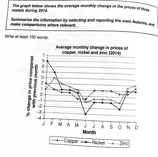
折线图以横轴(X轴)和纵轴(Y轴)构成坐标系,横轴多为时间(如年份、月份、季度),纵轴为数值(如数量、百分比、比率),数据点通过折线连接,体现动态变化,核心要素包括:时间范围、主体对象(若有多条折线)、变化趋势(上升、下降、波动、平稳)、关键数据点(峰值、谷值、转折点)及差异对比(多条折线间的交叉、高低关系),若图表展示“2010-2025年某国可再生能源与化石燃料占比变化”,需明确时间跨度为10年,主体为两类能源,重点描述两者占比的增减趋势及交叉节点(如哪一年可再生能源占比首次超过化石燃料)。
折线图写作步骤详解
审题:明确图表信息与写作要求
- 抓取主体与时间:首先确定图表描述的核心对象(如人口数量、经济指标、消费比例等)及时间跨度(静态时间点如“2025年”或动态时间段如“2025-2025年”),若有多条折线,需区分不同对象(如“A国与B国的GDP变化”)。
- 分析核心趋势:快速浏览数据点,判断整体趋势(如“整体上升”“波动下降”“先升后降”)及关键特征(如“某阶段增速最快”“某点出现拐点”)。
- 注意题目指令:雅思作文指令通常为“Summarise the information by selecting and reporting the main features, and make comparisons where relevant”(总结主要信息,进行相关对比),需避免描述所有数据点,聚焦“主要特征”与“对比”。
结构规划:四段式框架
折线图作文建议采用“引言-概述-主体-四段式结构,逻辑清晰且符合评分标准。
(1)引言段(Introduction):改写题目信息
用1-2句话概括图表内容,包括主体、时间及核心主题,避免直接抄写题目,需通过同义替换改写。
原题:The line graph below shows the percentage of people aged 15-24 in a country who were employed full-time from 1970 to 2000.
改写:The provided line graph illustrates the proportion of young adults aged 15-24 in a certain country who engaged in full-time employment over the three-decade period from 1970 to 2000.
段(Overview):总结核心趋势与对比** 段是评分关键,需用2-3句话概括图表最显著的特征(整体趋势+主要对比/差异),不涉及具体数据。
Overall, the percentage of full-time employment among 15-24-year-olds experienced a general decline over the 30 years, with the most significant drop occurring between 1980 and 1990. In contrast, the proportion of males employed full-time remained consistently higher than that of females throughout the period.(图片来源网络,侵删)
(3)主体段(Body):分点描述细节与对比
主体段需分段落展开,每段聚焦1-2个核心趋势或对比,结合具体数据(如数值、时间点)支撑,建议按“时间顺序”或“对象分类”分段:
- 按时间顺序:描述不同时间阶段的变化(如“1970-1980年:稳定上升”“1980-1990年:急剧下降”)。
- 按对象分类:若有多条折线,可分对象描述(如“第一段:A国的变化趋势”“第二段:B国的变化趋势及与A国的对比”)。
描述技巧:
- 使用“数据支撑+趋势解读”结构,如“在1970年,男性全职就业占比为60%,而女性仅为40%,表明性别差异显著”。
- 突出关键数据点:峰值(“在1995年达到最高点25%”)、谷值(“2000年跌至最低点15%”)、转折点(“1985年后趋势开始反转”)。
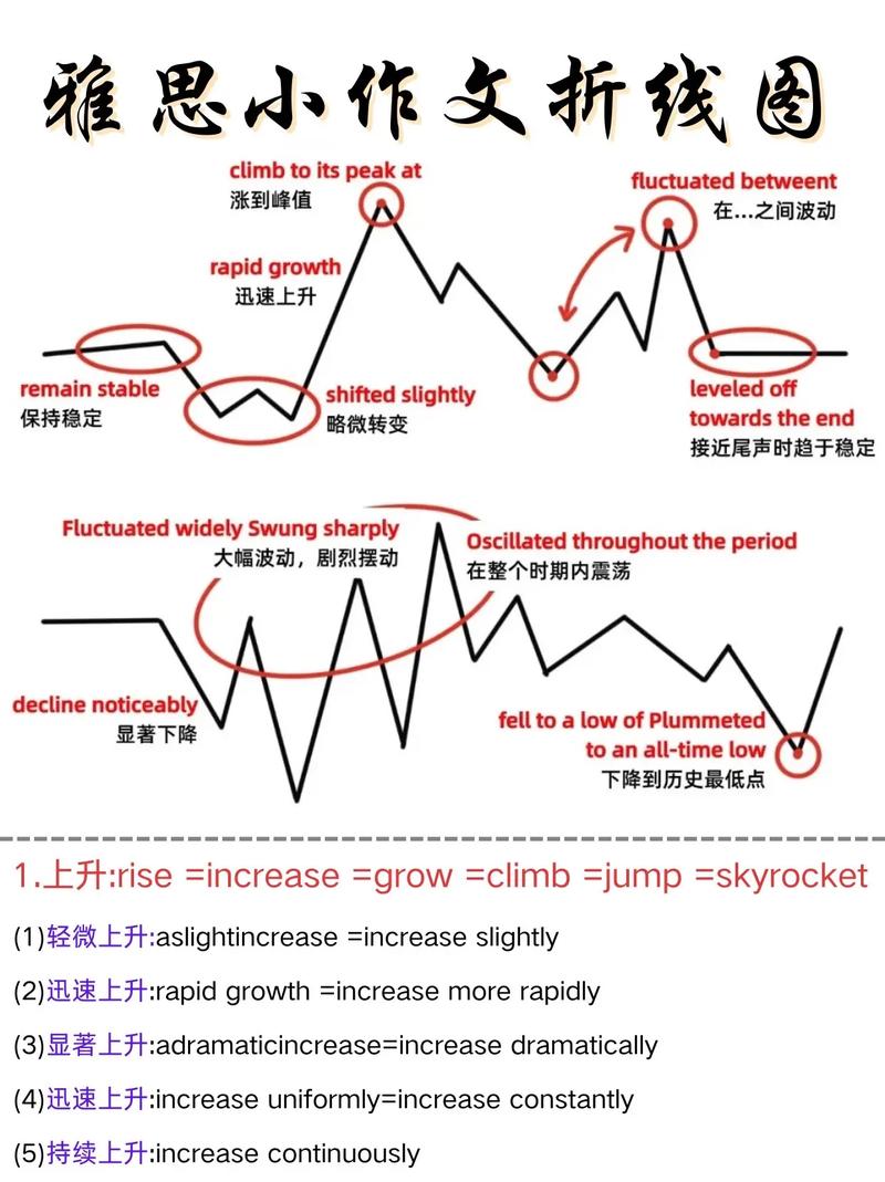
- 使用连接词体现逻辑:如“Initially, ...”(起初)、“Subsequently, ...”(随后)、“Meanwhile, ...”(、“In contrast, ...”(相比之下)。
范例片段:
In the first decade (1970-1980), the full-time employment rate for both genders showed a marginal increase. Specifically, the male proportion rose slightly from 60% to 65%, while the female figure edged up from 40% to 45%, narrowing the gender gap by 5 percentage points. However, between 1980 and 1990, a sharp decline was observed: the male rate plummeted to 50%, and the female rate dropped to 35%, with the gap widening again to 15 percentage points. This period likely reflects economic recessions or shifts in educational trends among young people.
(图片来源网络,侵删)
(4)结论段(Conclusion):重申核心观点(可选) 段已充分总结,结论段可省略;若需补充,可简要重申主要趋势或暗示可能原因(但避免主观臆断,如“可能由于政策影响”需基于图表信息合理推断)。
In conclusion, the data clearly illustrates a downward trend in full-time employment among young people from 1970 to 2000, with persistent gender disparities throughout the period.
常用表达与词汇
趋势描述
- 上升:increase, rise, grow, surge, climb, soar(急剧上升)
- 下降:decrease, decline, drop, fall, dip(小幅下降), plummet(暴跌)
- 波动:fluctuate, vary, oscillate
- 平稳:remain stable, stay constant, level off
- 程度副词:slightly(轻微地), moderately(适度地), significantly(显著地), dramatically(急剧地)
对比表达
- 超过:surpass, exceed, outnumber
- 低于:be lower than, be less than
- 相似:similar to, resemble, be comparable to
- 差异:differ from, a contrast between, a gap of
数据表达
- 数值:account for, constitute, make up, reach, hit, peak at, bottom out at
- 比例:percentage, proportion, rate, share
- 变化幅度:increase/decrease by 10%(增加/减少了10%), increase/decrease to 10%(增加/减少到10%)
注意事项
- 避免所有数据罗列:评分标准要求“select and report main features”(选择并报告主要特征),需忽略次要数据点(如微小波动),聚焦整体趋势与关键对比。
- 时态一致:描述过去时间的数据用一般过去时(如“increased from 2010 to 2025”);若图表含预测数据(如“至2030年”),未来趋势用一般将来时或“is projected to...”。
- 数据准确性:引用数据时需与图表一致,避免“约数”误差(如图表为52%,写作中不可写“约50%”)。
- 避免主观观点:折线图作文需基于客观数据分析,不添加个人观点(如“我认为政府应该...”),除非题目明确要求(如“Give reasons for your answer”)。
相关问答FAQs
Q1: 折线图有多条线时,如何安排主体段的结构?
A1: 若折线图包含2-3条线,建议按“对象分类”分段,每段描述一条线的趋势及与其他线的对比,先写A国的变化,再写B国的变化及与A国的差异(如“与A国不同,B国的数据在...阶段呈现上升趋势”),若超过4条线,可按“趋势相似性”分组(如“欧洲三国均呈上升趋势,而亚洲国家则波动下降”),避免段落过于冗长。
Q2: 如何处理折线图中的“波动”数据?
A2: 波动数据需描述“波动范围”及“关键转折点”,而非逐点列举。“从2025年到2025年,该比例经历了多次波动,在2025年达到峰值30%,2025年骤降至20%,随后在2025-2025年间维持在25%左右。” 若波动幅度较小,可概括为“整体保持平稳,仅在...有小幅波动”,避免使用“先升后降再升”等模糊描述,需结合具体数据点体现逻辑。