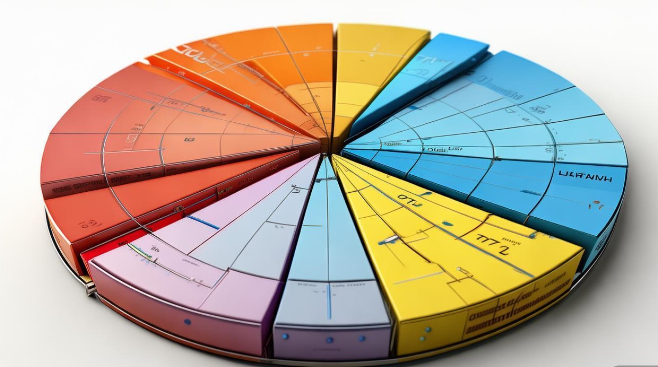
第一部分:饼状图作文写作结构
一篇好的饼状图作文应该像一个微型报告,结构清晰,逻辑严谨,通常分为四个段落:

开头段 - 引言
- 目的: 简要介绍图表内容,让读者知道这篇作文要讲什么。
- 指出图表类型:这是一个饼状图。
- 说明图表描述的对象:关于什么主题的。
- 点明时间范围(如果图表中有)。
- 句式: "The pie chart illustrates/provides information about the proportion of..." / "The chart shows the breakdown of..."
主体段一 - 概述主要特征
- 目的: 概括图表中最重要、最显著的信息,不要陷入细节。
- 找出最大和最小的部分。
- 描述几个主要的、占比相近的部分。
- 总结整体趋势,大部分...” 或 “...占据了主导地位”。
- 句式: "It is clear that... accounted for the largest proportion, at...%. In contrast, ... was the smallest category, making up only...%." / "The majority of... can be attributed to..."
主体段二 - 详细数据与对比
- 目的: 提供具体的数据,并对各个部分进行详细的描述和比较。
- 按照从大到小的顺序逐一描述各个部分。
- 使用具体的百分比进行比较。
- 使用连接词使段落流畅,如
while,whereas,compared to,in addition。
- 句式: "Specifically, ... constituted...%, which was slightly higher/lower than... that of... (at...%)." / "The figure for... was more than double that of..."
结尾段 - 总结
- 目的: 对全文进行一个简短的总结,重申主要发现。
- 不需要引入新的信息。
- 可以再次强调最重要的趋势或对比。
- 提出一个简单的结论或推论(如果题目允许)。
- 句式: "In summary, the data reveals that... was the dominant factor." / "To conclude, the distribution shows a clear preference for..."
第二部分:常用词汇和短语
描述图表:
- 动词:
- illustrate (阐明,图解)
- show (显示)
- represent (代表)
- account for (占...)
- constitute (构成)
- make up (构成)
- comprise (包含,构成)
- 名词:
- proportion (比例)
- percentage (百分比)
- share (份额)
- segment (部分,区段)
- breakdown (分类,细目)
描述数据大小和比较:
- 最大/最小:
- the largest / biggest proportion
- the smallest / smallest segment
- the majority / the vast majority (绝大多数)
- a significant / considerable portion (相当大的部分)
- a minority (少数)
- 比较:
- account for the largest/smallest proportion...
- constitute...%
- was significantly higher/lower than...
- was more than double/triple that of...
- accounted for roughly/approximately/about...% (大约)
- just over/under...% (略高于/低于)
连接词:
- 对比: while, whereas, in contrast, on the other hand
- 补充: in addition, furthermore, moreover
- in conclusion, to summarize, in summary, overall
第三部分:范文示例
这里提供三个不同主题的范文,从简单到复杂,供你参考。
简单版 - 学生最喜欢的科目
** The pie chart below shows the proportion of students' favorite subjects in a high school.
The Pie Chart of Students' Favorite Subjects
The provided pie chart illustrates the distribution of students' favorite subjects in a high school.
Overall, it is clear that Science is the most popular subject among students, while History is the least favored. The other three subjects, namely English, Math, and Art, have relatively similar levels of popularity.
Specifically, Science accounts for the largest share at 35%. English and Math follow closely, with 25% and 22% respectively. Art is chosen by 15% of the students, making it the second least popular subject. In contrast, History is the least popular, representing only 3% of the total.
In conclusion, the data reveals a strong preference for Science, and a clear disinterest in History among the high school students surveyed.
标准版 - 家庭能源消耗
** The pie chart shows the main sources of energy used by a typical household in a European country.
Energy Consumption in a Typical European Household
The pie chart provides a breakdown of the main energy sources used by a typical household in a European country.
Overall, it is apparent that heating and cooling consume the most energy, while lighting and appliances use the least. The three remaining categories, water heating, refrigeration, and electronics, account for a moderate and relatively equal portion of the total energy use.
Heating and cooling constitute the largest segment of energy consumption, making up 42% of the total. Water heating is the second highest, at 30%. Refrigeration, electronics, and lighting represent smaller shares, at 15%, 8%, and 5% respectively. Notably, lighting uses the least amount of energy compared to all other categories.
In summary, a household's energy expenditure is dominated by the need for temperature control, with lighting being a minimal contributor to the overall energy demand.
进阶版 - 不同年龄段社交媒体使用原因
** The charts below show the reasons why people of different age groups use social media.
Reasons for Using Social Media by Age Group
The two pie charts illustrate the primary motivations for using social media among two distinct age groups: teenagers (13-17) and adults (30+).
A clear contrast can be seen in the reasons for social media use between these two demographics. For teenagers, the main purpose is social connection, whereas for adults, staying updated with news is the most significant driver.
Among teenagers, connecting with friends and family is the dominant reason, accounting for 45% of responses. Following this, entertainment and following celebrities make up 30% and 15% respectively. Only a small fraction, 10%, use social media primarily for news. In contrast, for adults, staying informed about current events is the top priority, constituting 50% of their usage. Connecting with others is also important but less so, at 35%. Entertainment is a much smaller factor, at just 10%, and following celebrities is the least common reason, representing only 5%.
In conclusion, while both age groups utilize social media, their core motivations differ substantially. Teenagers are primarily driven by social interaction and entertainment, whereas adults are more focused on information gathering and news updates.

